I find it a challenge to balance somber and pretty for sympathy cards. I like them to be able to bring a little brightness to a very somber occasion. This one I think balances well. The yellow paper is a bit cheerful but is balanced by the grey which is the reverse side of the yellow paper.
 I used an ivory base. The DPs are SU. The sentiment is on a Nesties Label. The background flowers are from SU Summer Silhouettes and the sentiment from SU Love and Sympathy. I think decorating a little on the inside shows extra care so I used the Summer Silhouettes over the sentiment on the inside.

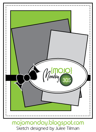
This is following the sketch from Mojo Monday


This is following the sketch from Mojo Monday


So soft and pretty! Love these comforting colors.
ReplyDelete