Wednesday, July 30, 2014

Tuesday Morning Sketch

It is sad that I am needing a lot of Sympathy Cards lately. But taking the time to make a special card gives me an opportunity to reflect on life of the deceased and their family.
The burlap flowers are by Recollections purchased at Michael's. The lighter ones can also be sponged with any colored ink for an interesting variation. The image and sentiment are from SU's Simply Sketched. I lightly colored the image with colored pencils.
The layout is from this sketch from Tuesday Morning Sketches
 

Saturday, July 26, 2014

Great Buy

I found some great buys at a yard sale yesterday. I bought 3 SU Paper Pumpkin kits for $5.00. I didn't want all the same design cards so I mixed stuff from the 3 set to make some quick thank you cards.
The punched scallops and circles are from my scraps.And the SU Thank You stamp did not come in the kits. I ended up with 8 cards and supplies left over for more.
I have never done 2 different cards for 2 different challenges in the same post but since the cards coordinated, I wanted you to see both together.
The first is the design from Freshly Made Sketches

And the second is the design from Case This Sketch

Thursday, July 24, 2014

Make a Wish

I have a clean and graphic card for The Card Concept challenge using aqua, lime, and white. Following this sketch from Pals Paper Arts made this card come together very quickly.
07-24
Here is my version
I cute squares from lime and aqua from my scrap bin. The sentiment is SU's Perfect Pennants set stamped in Lucky Limeade on a scrap of white.. The old, old, cupcake image was stamped on scrap white, colored with an  aqua colored pencil and fussy cut. I added "sprinkles" to the icing with different colored star gel pens and then covered it with clear glitter glue. Crystal effects to the cherry adds some shine.

Wednesday, July 23, 2014

Sunflower

I purchased some large adhesive dots a long time ago and just hadn't used any of them yet. When Tuesday Throwdown came up with handmade flowers for this week's challenge, I decided it was time to break out the adhesive dots.

I have some ribbon from WalMart called "Wraphia".  It is kind of a light plastic texture. I unrolled 3" strips of it, sponged some orange on the edges and then folded them in half and secured to the adhesive dot. I punched out the brown center and dotted it with a black Sharpie. The leaves are punched with a SU punch from scraps of green. To add a little more texture, I used PTI's linen texture plate and ran the base through Big Shot. Sentiment is from The Angel Company.
I followed the sketch from Tuesday Morning Sketches

Tuesday, July 22, 2014

Dog Days

This card is a case from Cheryl at Paper Panacea.  See her card here. It is so cute! She posted her card a couple of weeks ago and I am still chuckling about it. So thanks to Cheryl, here is my card.
When I saw the sketch from this week's challenge at The Kraft Journal, I saw an opportunity to use this sentiment. The dog/hydrant stamp is from Great Impressions, colored with pencils. The card base if Kraft.The DP is from SU, I think the design looks a little likerows of  paw prints. The sentiment and inside are done on the computer.
Here is the inside
I added a paw print with a stamp from Sarasota Stamps. Both of the stamps were purchased at a trade show. I don't know if they are available online.
Here is the sketch from The Kraft Journal


Curtain Call

From this inspiration picture by Curtain Call Challenge

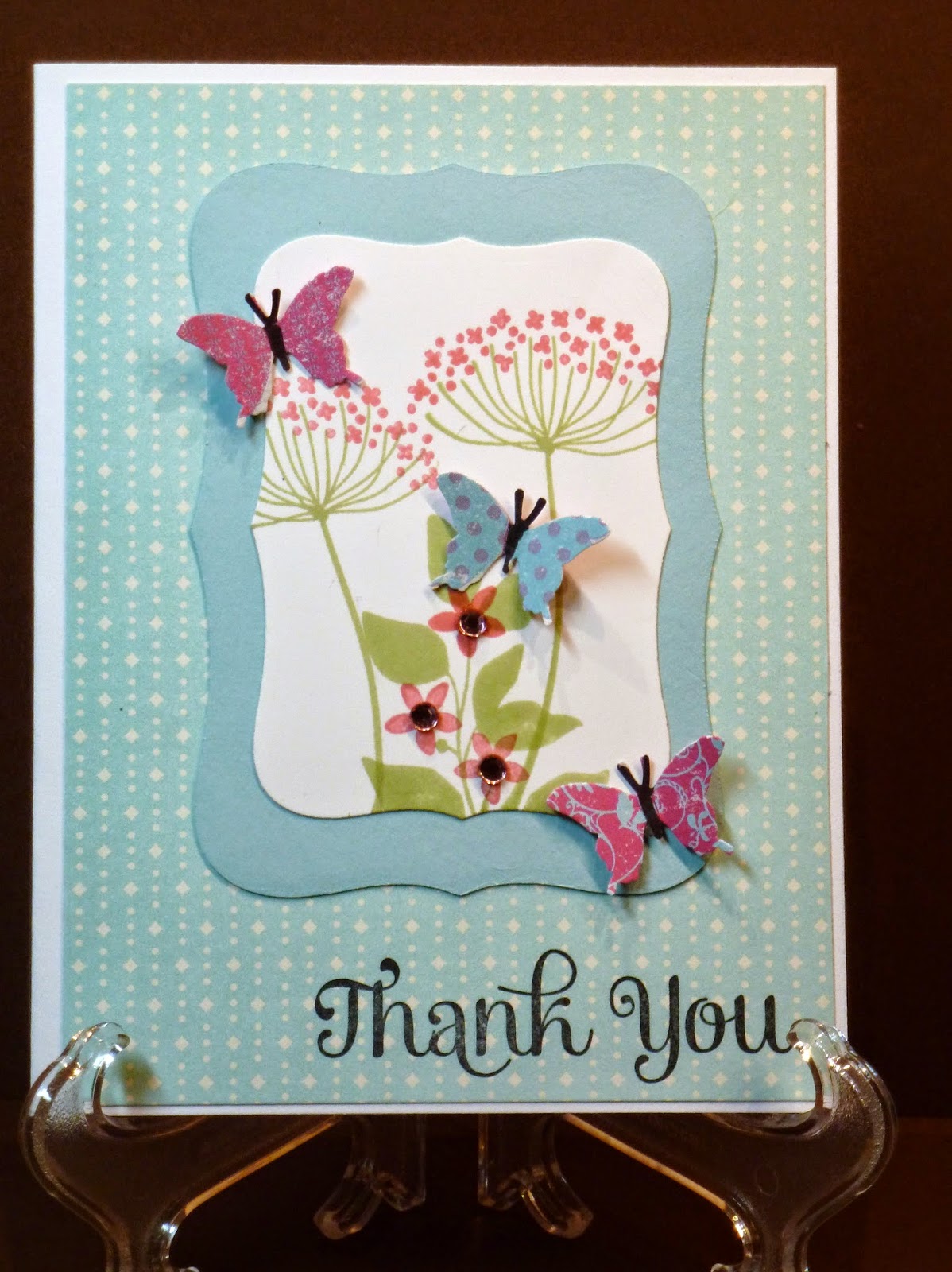
I picked up on the pink and aqua colors and made a thank you card
The DP is from SU. The floral stamps are from SU's Summer Silhouettes. I think I have used that set more than any other. The butterflies are punched from a sheet of rows of colorful butterflies by Elizabeth Park. They look black in the photo but the flower centers are pink rhinestones. The sentiment is also SU.

Thursday, July 17, 2014

Hugs

I just love grey and yellow together. It seems so sweet and cheerful.
And I really like  the versatility of the sketch from Freshly Made Sketches this week. I am going to keep this one on file for use again.
A friend is going through a difficult time right now and I just wanted to send a card to give her a boost.
The grey polka dot paper is actually from a shopping bag. I love when I can reuse normally thrown away items. The 2 banners are Bo Bunny scraps. I colored a flower stamp from SU with green and gold Tombow water color markers and stamped it on a punched scallop circle. They don't show in the picture but I put a tiny pearl at the center of each yellow flower.The "hugs for you" is an old stamp from The Angel Company. 
Here is the sketch I followed:


Wednesday, July 16, 2014

Two cards One sketch

We have friends moving away in September after their baby is born early next month. Talk about stress!!
We are having a going away party and baby shower. So I used the Tuesday Morning Sketches design to make both cards.

The house is a stamp from The Angel Company colored with pencils. The "grass" paper and scalloped border are scraps. I sponged sky blue on the top half of the card and stamped the sentiment, also from TAC, onto a punched cloud.
They do not know the sex of the baby. So I used all the pastel colors here. The duck is a die cut purchased at a trade show several years ago. I used punches for the circles and then glued the duck onto the circle stack. I took the negative of the blue scallop punched strip to make a bit of "water" under the duck. The polka dot DPs are from Bo Bunny. The sentiment is SU and colored in alternate pink and blue.
Here is the sketch from Tuesday Morning Sketches

Tuesday, July 8, 2014

Minecraft Creeper

Okay, so don't get all "creeped" out and think "what in the world is she thinking?"
My grandsons play a video game called Minecraft. Andrew wants a Minecraft theme birthday party this year. I really don't know a lot about the game except from watching him play. I know everything is in graphic squares and pixelated. So I have been playing around with images from the game. This one is called creeper. I printed it from an internet image onto some green textured paper from www.coordinations.com.  I used a Tim Holtz stencil and sponged on some white and black to make that pixelated effect.. The blues represent other aspects of the game--water, blue diamonds, etc. The black is textured with IP folder from Darice. The grey strip was run through with an IP from Cuttlebug. I cut out the creeper and popped him up on Dimensionals.
What we won't do for our grandchildren!!!
One of the craziest cards I have made for the sketch from Tuesday Morning Sketches which adds the challenge of using green, blue, and black.